


ART 370: A Furniture Making 8:30-10:50 T/R am Graham
This course will be an introduction into the techniques and concepts of traditional and non traditional furniture fabrication. Areas to be covered will include but not be limited to wood selection and movement, hand tools, power tools, traditional and non traditional joinery, wood manipulation and finish work. Each student will complete the course with 2 designed and finished pieces as well as a physical lexicon on joinery with container.
ART 370: B Portrait and Lighting 1:00-3:20 T/R pm Kincer
A semester of intermediate photography focusing on ideas, issues, and possibilities related to portraiture with special attention to lighting techniques. For those with experience in photography, this course will address issues of technique with regards to camera control, set and location planning, model stylization, and specific lighting controls, as well as an investigation of numerous methods, styles, and concepts for capturing the human form. The primary method of production will be digital photography, with the possibility of exploring traditional photographic printing methods. Use of a DSLR camera is recommended, but not required. Prerequisite: ART 120 or permission of the Instructor.
ART 370: C Publication Techniques 3:30-5:50 T/R pm Shields
Students will learn skills and concepts necessary for publication design while engaging in a thorough study of composition concepts including grids, typography and color theory. Fields of publication may include newspaper, periodical, directory, book, or brochure design. Application and output will be explored with the examination of industry processes and methods. Guest speakers and field trips will enhance students’ understanding of methods and application in a real-world atmosphere.
Software Utilized: InDesign, Illustrator and Photoshop
Prerequisite: ART 234
ART 470: A Modern/Contemporary Mexican Art 12:00-1:15 MW Ratliff
This course examines modern and contemporary trends in the visual culture of Mexico. The course will begin with a brief overview of the history of art in Mexico but will predominantly focus on works and artistic formations relevant to the debates around visual modernism and contemporary culture in Mexico: tradition and modernity; national culture and the indigenous and colonial past; the role of visual culture in defining & differentiating national identity; cultural and aesthetic mestizaje; race, gender, and representation; the art and politics of popular and avant-garde cultures; art by Mexican-American artists in the U.S.; and the effects of globalization and the art market on contemporary Mexican art. We will examine the dominant art forms of late nineteenth- and twentieth-century Mexico including post-revolutionary muralism and socially-concerned representational art in addition to movements, artists, and visual genre outside of the mural school including abstraction, surrealism, photography, print culture, film, and performance art. The lectures, class discussion, and readings will focus our attention on key topics and ideas that help situate individual artworks within broader social and art-historical perspectives that operate in Mexico. Prerequisite: One course in art history or permission of the instructor. Students with an interest in Latin, Mexican, or Hispanic cultures and civilizations are particularly invited to register for this course. For further information, contact the professor: Jamie_Ratliff@georgetowncollege.edu
Feel free to ask faculty about their courses. You won't want to miss these amazing opportunities!
PS: Declare your major!
 Opening reception tomorrow, Thursday, October 28 from 5-7 in the Tuska Gallery at UK, located on Rose Street in the Fine Arts Building (next door to the Singletary Center for the Arts). The show will run from October 28-November 11. Click for HERE for more info.
 I hope that you will have the opportunity to come to the opening, or at least see the show before it closes. This is a great chance to see your faculty exhibiting work that you won't want to miss. How often do you get to see your professors practice what they preach?
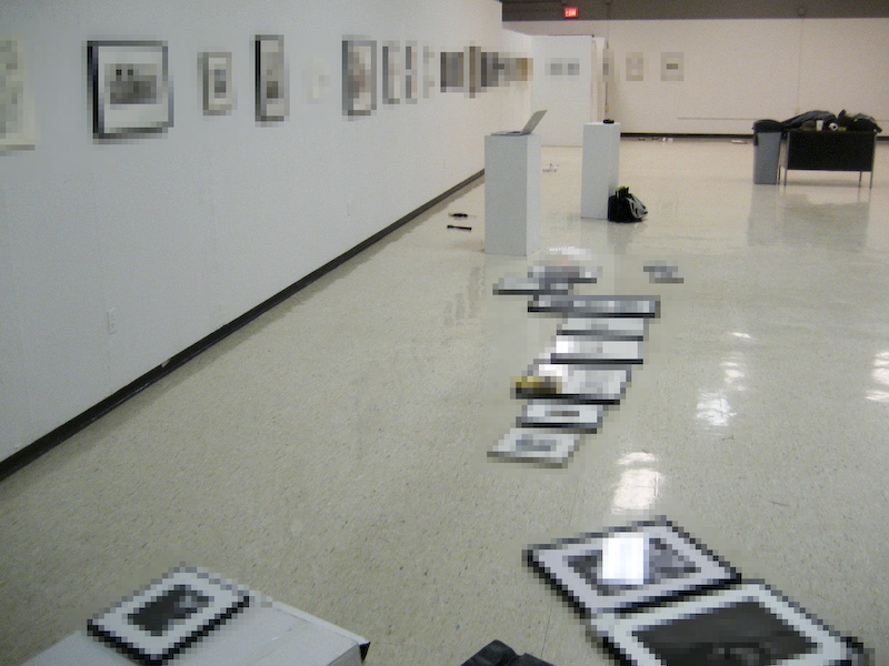 I have to say that this has been a fantastic experience. Daniel and I had so much fun collaborating and working together. And although it has been exhausting pulling this off, it has certainly been worth the investment.
 If you're not aware of how the show works, Daniel and I looked back at our careers (all they way back to our first art classes in college) and created a chronological installation of pieces that stood out to us, culminating in eight collaborative works that we just finished yesterday. My earliest piece is from 1997 and Daniel's, 1998. You could say that there's 2.5 decades worth of work in this show.
This contest information was passed on to us by Dr. Rich in the Japanese Dept.
Furoshiki, or wrapping cloths, are stylish and distinctive everyday
items emblematic of the Japanese tradition of wrapping things. Since they are
reusable and therefore do not impose a burden on the environment, furoshiki
have attracted renewed interest in recent years, both in Japan and elsewhere.
In 2009 the Japan Foundation held an Original Furoshiki Design
Contest, soliciting submissions from students of design in 10 countries. A total
of 373 entries were submitted, and three were selected to receive top prizes.
Furoshiki displaying the top prize designs are now on sale at museum gift
shops and other venues in Japan. Full information is also available on the following website:
The Japan Foundation, New York: http://www.jfny.org/
If you have any inquires, please send an email to: Furoshikicontest@jfny.org


The University of Oxford is famed for its interview questions -- not because they are particularly difficult in terms of demonstrating intensive academic knowledge but, rather, because they engage prospective students in ways of knowing. Dr. Lynn Robson, lecturer in English and frequent visitor to our college during the spring Oxford interviews at Georgetown College, disclosed one of the typical questions asked of Oxford-wannabees: "Why do you think an English student might be interested in the fact that Coronation Street has been running for 50 years?" [For those who may not be familiar, Coronation Street is a British soap opera featuring stock characters (from a host of social classes) such as the busybody, war vet, and pensioner as well as youthful rebel and university student.]
On the surface the question seems mundane. It throws students for a loop because it's not a particularly scholarly question that might yield a demonstration of knowledge of the thousands of pages of literature with which the interviewee may be familiar. Yet, it is an interesting conversation starter aimed at seeing how people respond to known material. Robson notes that this question “first and foremost...brings popular culture into the mix and shows that techniques of literary analysis can be applied to other media. It could also open up discussion about things such as techniques of storytelling; mixing humorous and serious storylines/characters; how a writer might keep viewers or readers engaged; collaborative writing; the use of serialisation, and how writers/texts might move from being perceived as ‘popular’ (like Dickens, say) to being ‘canonical’.”
How would you respond to a question like this? Examples might include:
As we bring the semester into its final third, consider these kinds of questions as you approach art, design, and research projects. Consider what your work offers to its audience. Consider its purpose, goals, and objectives. Consider decisions made at every step of the way. Are you able to articulate your thoughts about your own production and that of others? How do you see your work fitting into the larger matrix of work produced as a graduating senior, an art student, an artist, or any other identifying group? Feel free to stop by my office and chat about ways of knowing and ways of answering the question...whatever it may be.
For more information on the Oxford interview, see the Times Higher Ed article.
From Holly James, Calling and Career Center:
Client is in need for an intern to assist with
1) Revamping her website ( simplifying & organizing)
2) Assist with the completion of her 1028 application, writing her mission statement, business plan and creating a PowerPoint.
You can view her web site at http://www.straightshotinc.com/ Time commitment would be approx. 10 hours a week. Contact Holly for details.


Join this community of artists who have launched a revamped website devoted to showcasing young talent in a free and open landscape. If you're an art major or minor, consider sharing your talent with the Saatchi empire -- yes, the same Charles Saatchi who sponsored the yBas. Visit www.saatchionline.com
10/19/2010: From Holly James: There is a paid position at Wade Embroidery And Screen Print, at the Outlet Center in Georgetown. The posting reads, "We are in need of a part time employee that has some experience in Photo Shop. A work schedule is very flexible at this time and I would anticipate the hours to be around 15 to 20 a week. Send a brief resume or experience in Photo Shop can be sent to the email address: pwade@phoenix-transportation.net or contact Holly James in the Calling and Career Center for a phone number.


 |
| example of lithographic limestone |
 |
| Paper being pulled off stone after printing. |


The college catalogue from 1846 described behaviors that were preferred among the student population: "The College is open to persons who desire to study in particular departments only. Such persons must give satisfactory evidence of good moral character, and possess such previous acquisitions in the branches they mean to pursue, as shall qualify them to study with some of the regular classes." A description of such character is not provided, neither are the means by which one should attain it.
A century and a half later, we have no such clause in the college catalog and yet it goes without question that rules and codes of behavior, or, even guidelines for moral character have been a part of the college's history as much as its traditions. Putting this story into visual and verbal form was the task put before students in my Curatorial Studies course. As I mentioned in an earlier post this semester, each fall students in ART 302 prepare an exhibition that is on display in the Cochenour Gallery around our campus celebration of Homecoming. The first exhibit was curated in 2005 and entitled “Faith Ablaze! The Chapel Fire of 1930.” This show recounted that tragic, chilly April morning as the building was lost to the smoke and flames. For the 2010 exhibition, students have been researching the rules and regulations of the college from the earliest College Catalogs of the mid-nineteenth century to the present day. This proved quite challenging because the topic for the exhibition is not entirely focused or well-documented, such as an historic structure or event. Nor is the focus on a specific population, such as alums from a certain dorm or major or club.
The show has been curated, installed, and is now on view in the LRC. Please join us on Friday from 12-2 in the Cochenour Gallery where students will be on hand to discuss their work. The students who prepared the exhibition include: Celisa Bowen, David Gardner, Bess McHone, Jacob Pankey, and Weezie Payton. We also had the help of an alum, Daniel Ware, class of 2010. While browsing the display case and installation of two dorm rooms, you'll be able to enjoy amazing dainty delights made by GC alum, Amanda Hervey. In addition, we'll convene a Fireside Chat at 1:00 with Doc Birdwhistell and a few other GC alums and friends, including Jane Hope Fields, Ann McCamy, Kyle Potter, Kitty Taylor, and Wallace and Judith Williams. All will share insight about rules and regulations. Topics include:

The Contemporary Arts Center in Cincinnati currently has on display a temporary exhibition of contemporary art entitled Where Do We Go From Here? This exhibit consists of selections from the Jumex Collection, the largest collection of contemporary art in Mexico, and probably the largest in Latin America. Amassed by Jumex juice company heir Ernesto Lopez during the 1990s, this collection has been lauded as possibly the best collection to incorporate Mexican and Latin American contemporary art with examples from the United States, Europe, and other countries around the globe. Out of the approximately 1400 works that comprise the entire collection, nearly a full third were created by artists either born or working in Latin America. Art historians and critics have celebrated this collection as one of the first to include Latin American art not as a peripheral phenomenon, but as a major artistic player in the global market.
According to the curators, the show is divided into four thematic, interwoven areas: “art about art; art and urban anthropology; text in art; and a series of succinct artist profiles.” Where Do We Go From Here? is an exhibit that is meant to question the current state of art, investigate some prevalent concepts from the past few decades, and to highlight specific artists whose works have contributed greatly to our understandings of contemporary art. As the title indicates, the exhibit also hopes to point toward the possible future or futures of contemporary art. For me, as an historian of Mexican art, this exhibit is exciting because it points to a future in which the contemporary art of Mexico and other Latin American countries, or any country or culture whose art has traditionally fallen outside the “Western canon,” are presented without national qualifiers.
Artists represented in the exhibit include:
Francis Alÿs, Carlos Amorales, John Baldessari, Stefan Brüggemann, Maurizio Cattelan, Abraham Cruzvillegas, Minerva Cuevas, Ale de la Puente, Gardar Eide Einarsson, Peter Fischli & David Weiss, Claire Fontaine, Claire Fontaine, Reena Spauldings and Bernadette Corporation, Mario Garcia Torres, Douglas Gordon, Daniel Guzmán, Jonathan Hernández, Jenny Holzer, Donald Judd, On Kawara, Jeff Koons, Joseph Kosuth, Gabriel Kuri, Louise Lawler, Sherrie Levine, Paul McCarthy, Jorge Méndez Blake, Jonathan Monk, 'Moris' Israel Meza Moreno, Sarah Morris, Gabriel Orozco, Damian Ortega, Richard Pettibone, Jack Pierson, Ugo Rondinone, Ed Ruscha, Rudolf Stingel, Rosemarie Trockel, Kelley Walker, Andy Warhol, Lawrence Weiner, Franz West, Cerith Wyn Evans
I’ll be planning a visit on a Saturday in November (probably Nov. 20). If anyone is interested in joining me, please contact me for details. The show will be on view through January 30, 2011.
 ImPrint, this Friday (Oct. 15) in the Wilson Gallery. Sixteen artists—41 works. Opening reception, 5-7 PM. Art talk around 5:15 (Nexus). Print demo, Saturday morning, 9-10 AM.
 Also as a reminder, I'll be participating in an artist talk for the KY.7 Biennial for the Lexington Art League at the Louden House in Lexington on Thursday, starting at 7 PM. Four other artists will also be speaking about their work. Hope to see you there.
